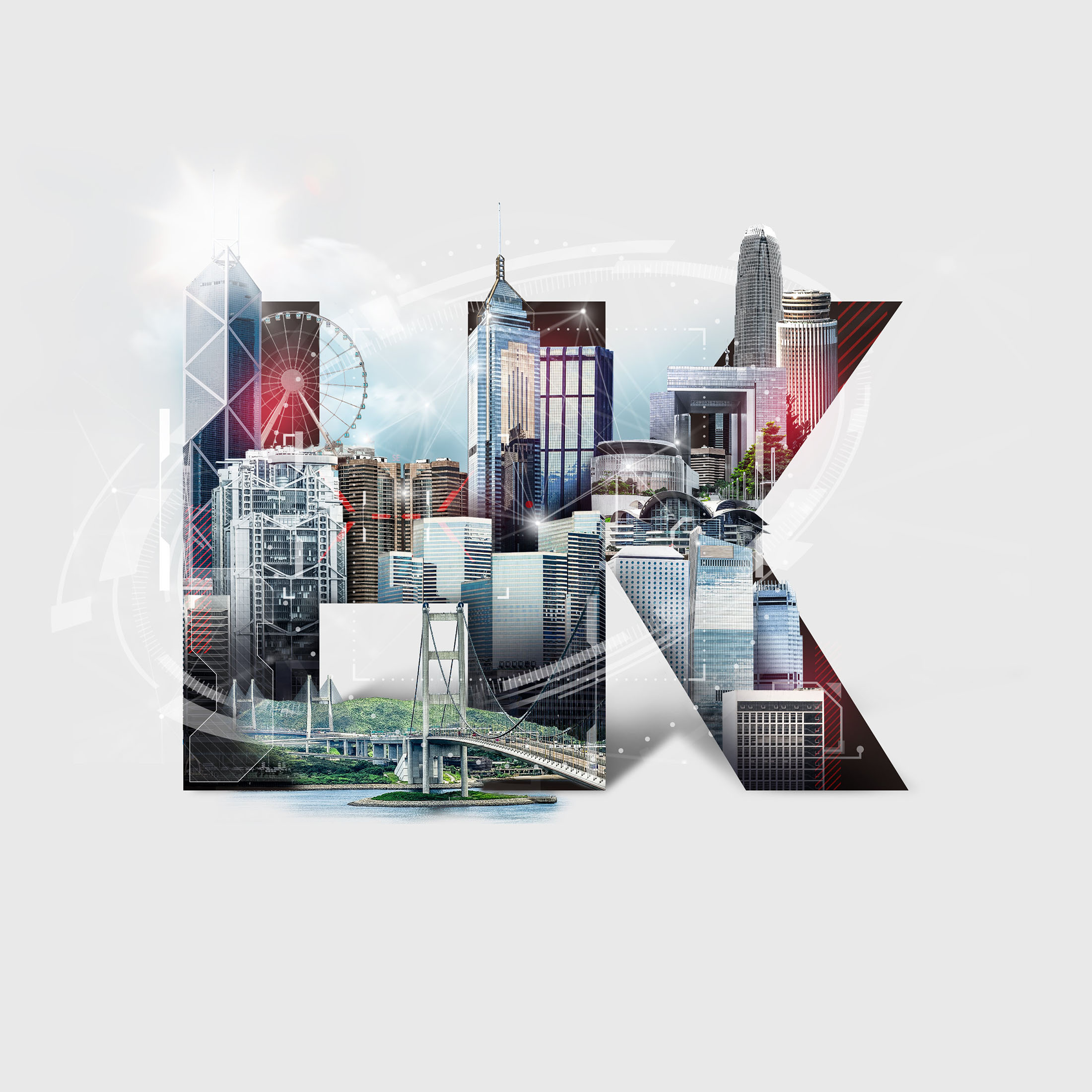
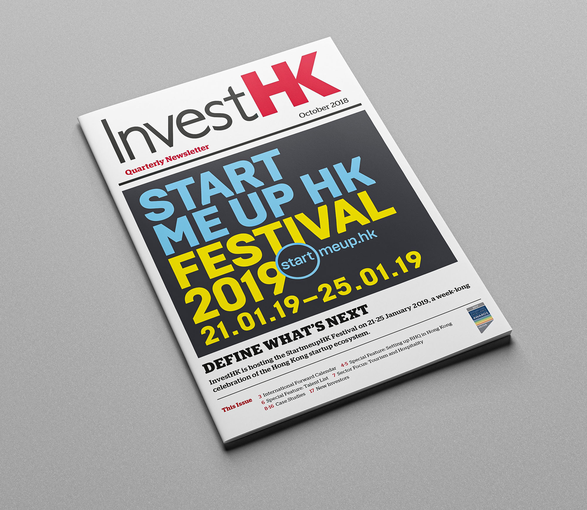
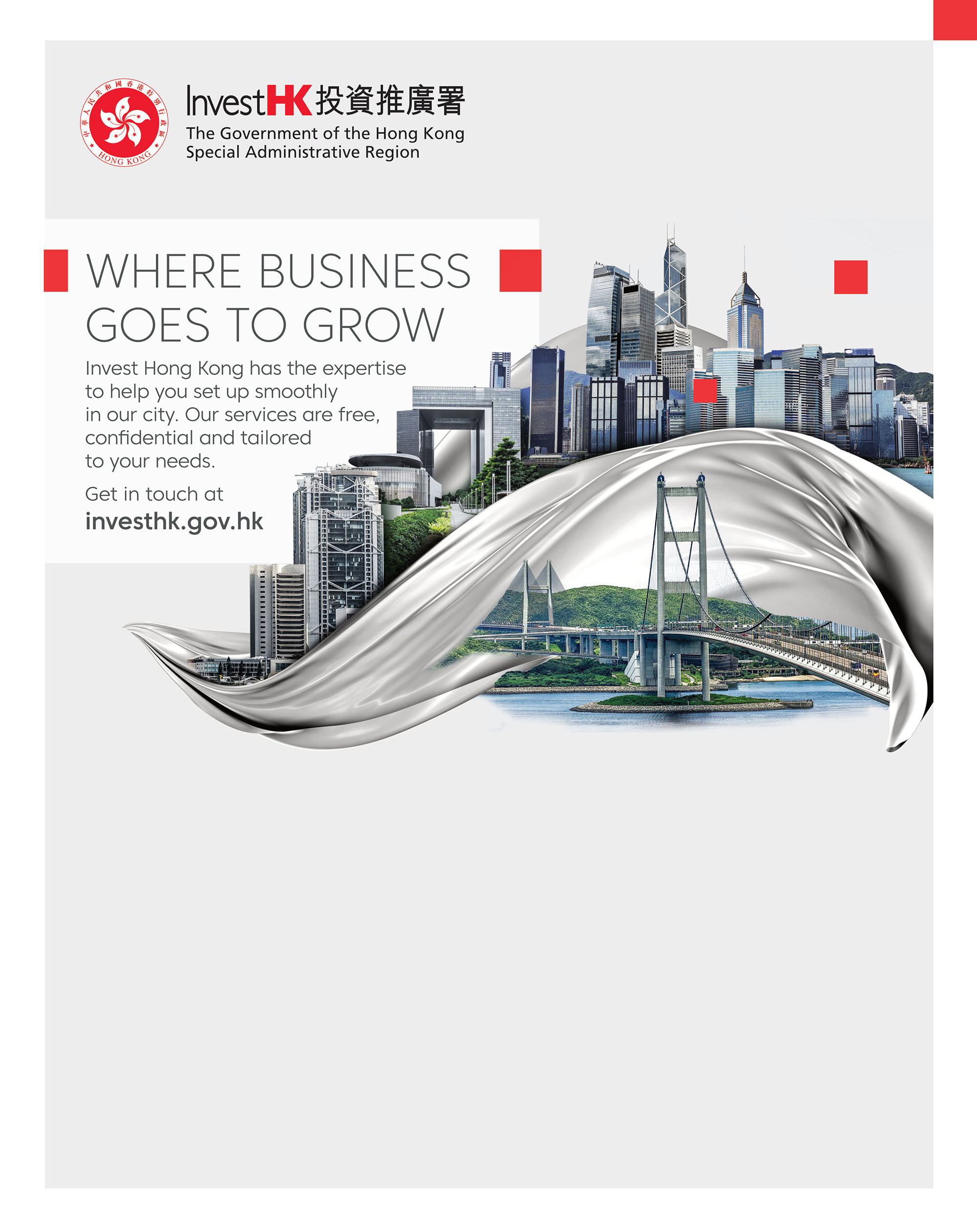
Create new marketing visuals to promote Hong Kong as a top investment destination and support the government’s efforts to attract foreign investment. The main visual for InvestHK reimagines the iconic Hong Kong skyline. The design features a minimalistic, oversized silk material enveloping the buildings, symbolizing the Belt & Road Initiative and highlighting Hong Kong’s advantages for business expansion.
Before Refresh
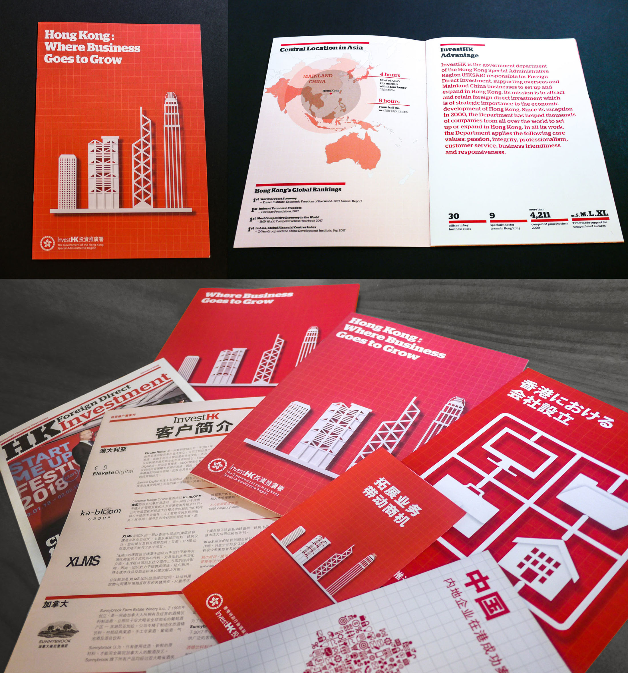
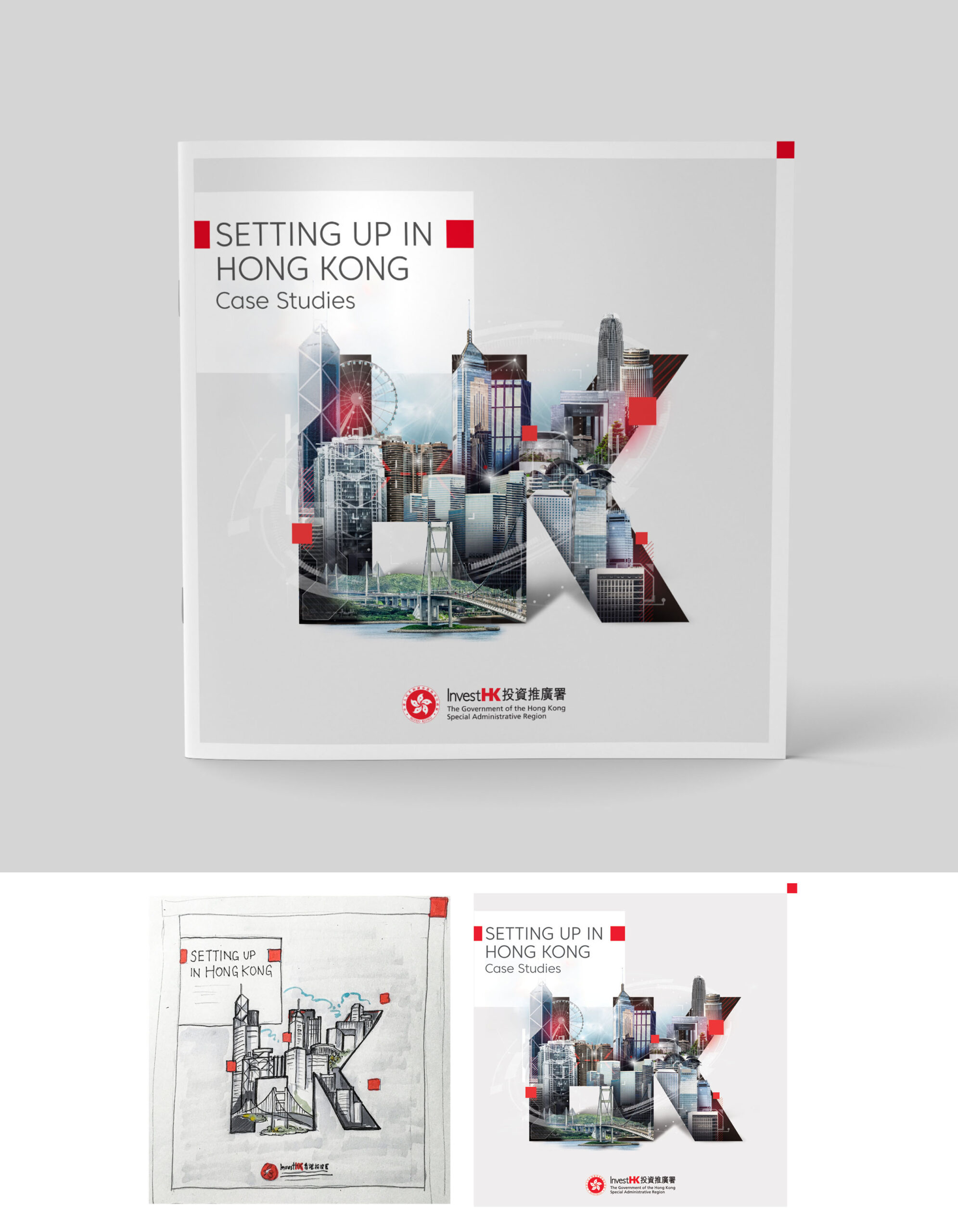
A bold red color has been dominantly and consistently used in InvestHK’s previous marketing materials. However, the overall color palette, along with the typography and paper material, has become dated over the years and no longer aligns with InvestHK’s current marketing plans. Additionally, other marketing materials, such as sector and country-specific brochures, lacked consistency in design direction and style.
