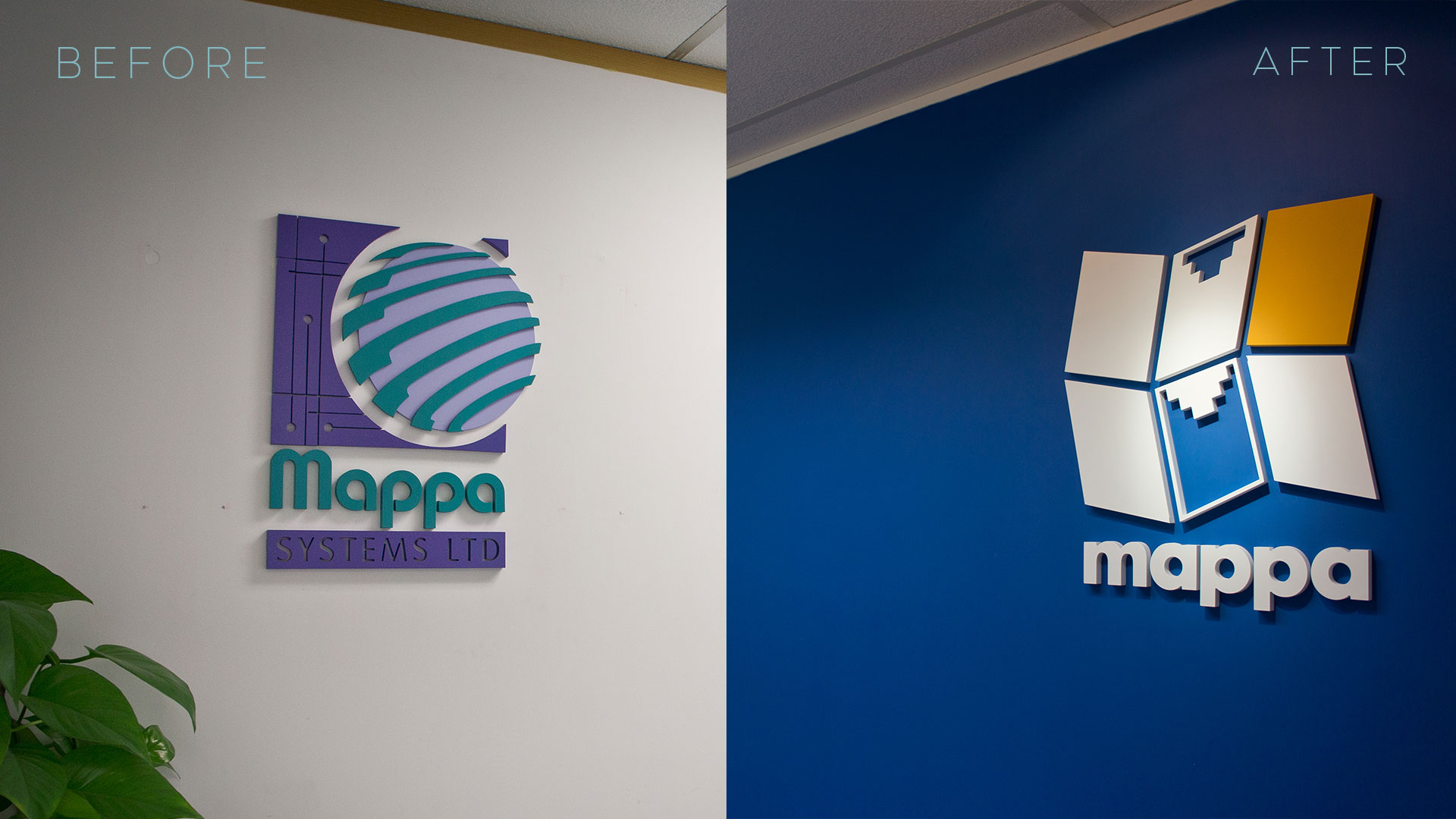
Mappa’s Logo Re-design
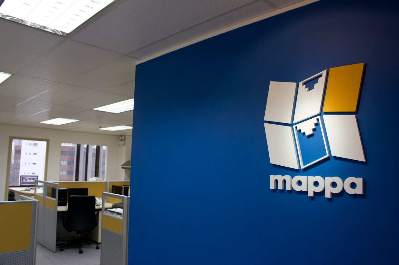
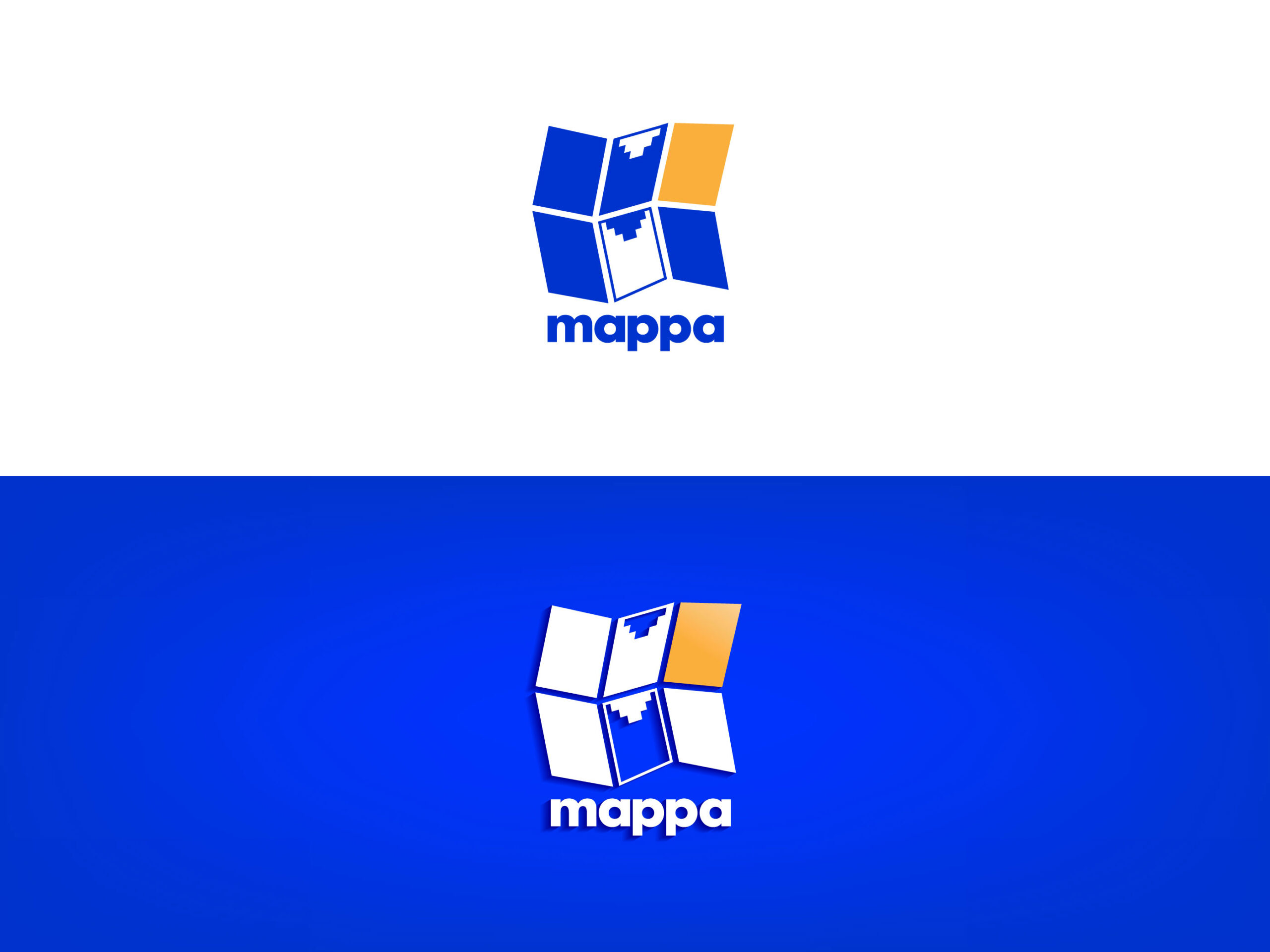
I partnered with Mappa System Ltd. in 2005 for IT services, mainly GPRS mapping. They updated their old logo to a new one with an M and digital fold map, using tech blue and orange as the main and accent colors respectively.
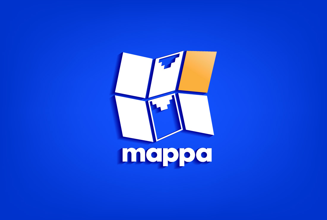
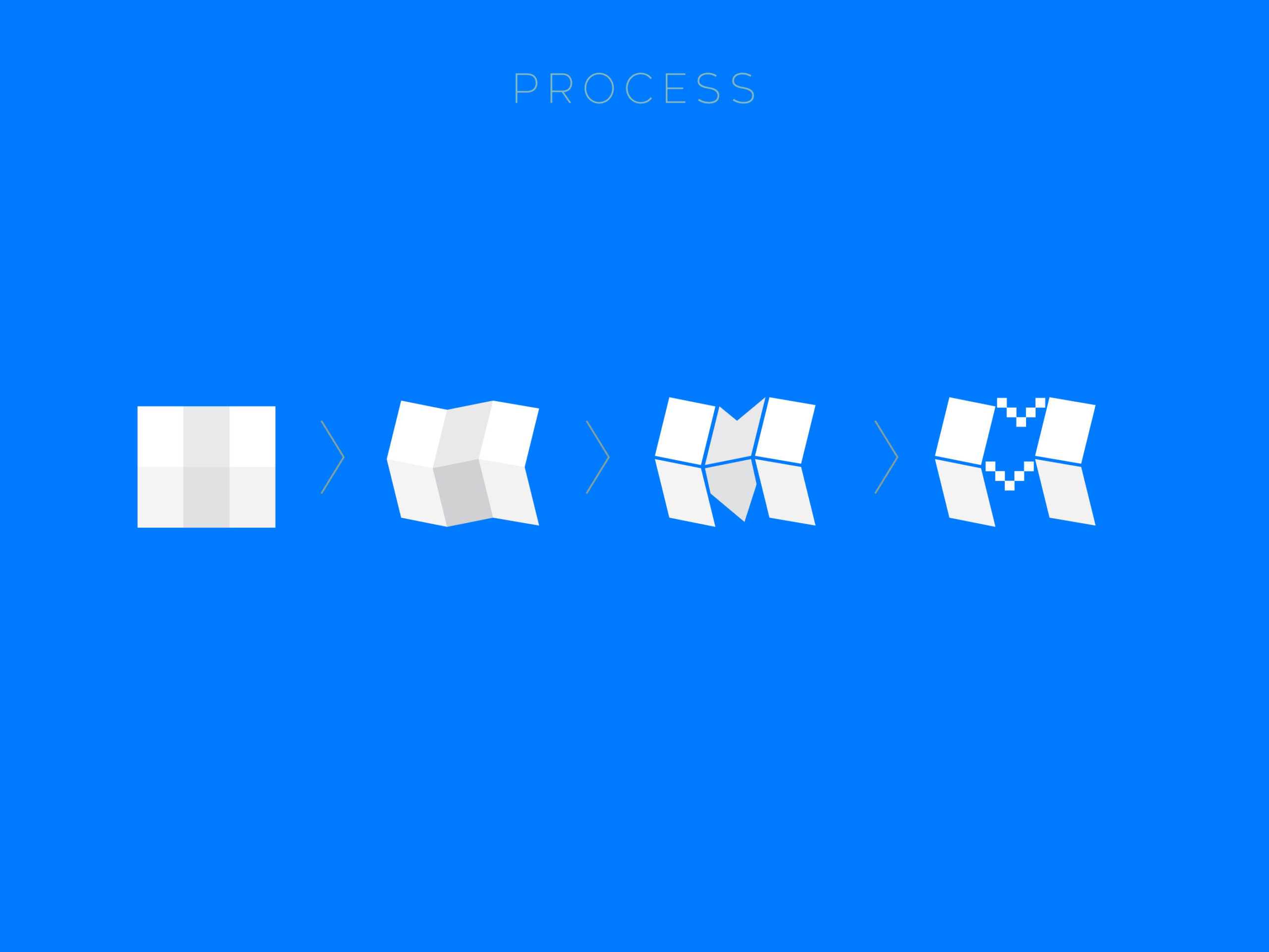
The main idea of the logo is to transform a physical, unfolded paper map into a digital format.

Ends up, it looks good on different materials because of its bold and easily recognizable shape.