コンテンツにスキップ
Close Trigger
ホーム
»
制作実績
»
ロゴのリデザイン
»
新森林ロゴのリデザイン
新森林ロゴのリデザイン
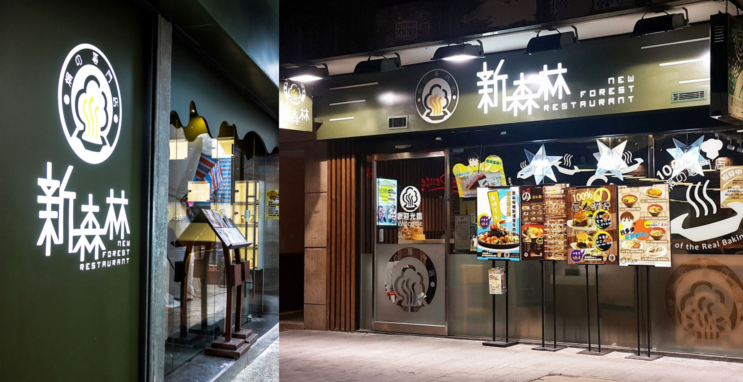
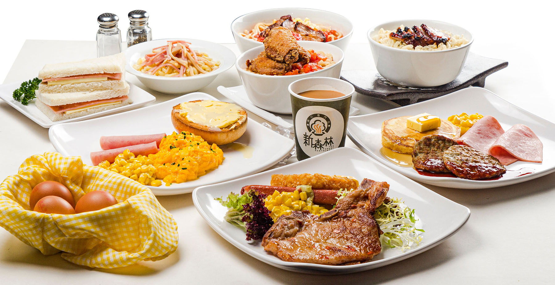
1998年にオープンした新森林レストランは、ベイクライス料理で有名です。2003年に広告会社で働いていた時、私はこのレストランでの食事を楽しんでいました。しかし、オーナーはロゴが魅力的でないと感じており、問題点や改善方法を見つけることができませんでした。そこで、私にロゴのリデザインを依頼しました。
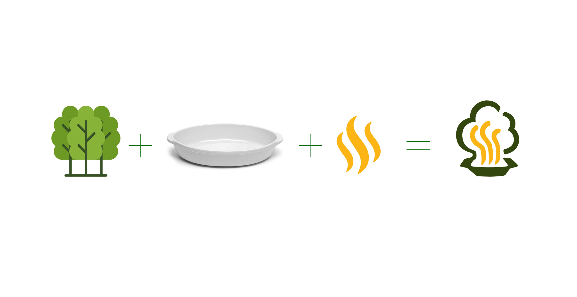
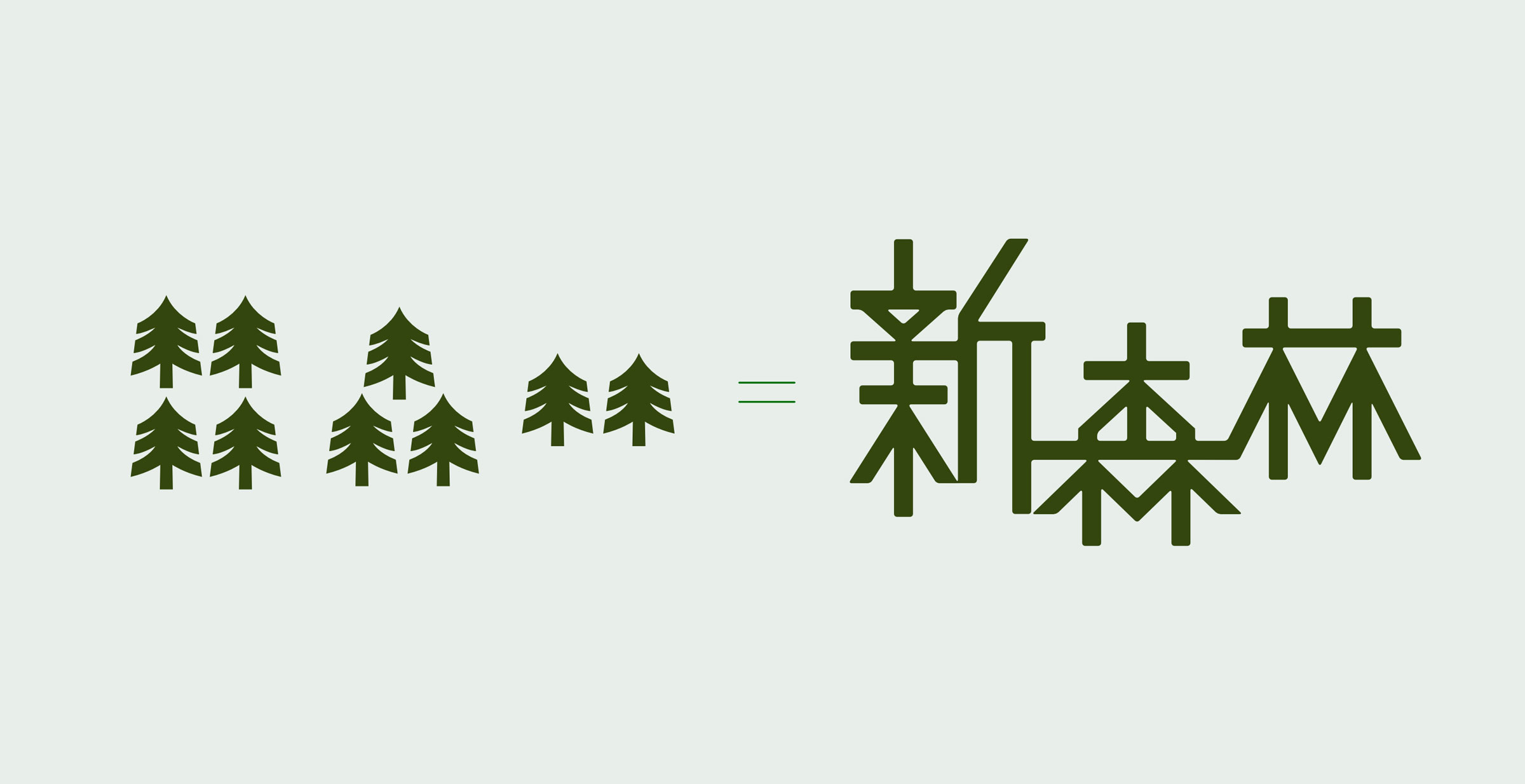
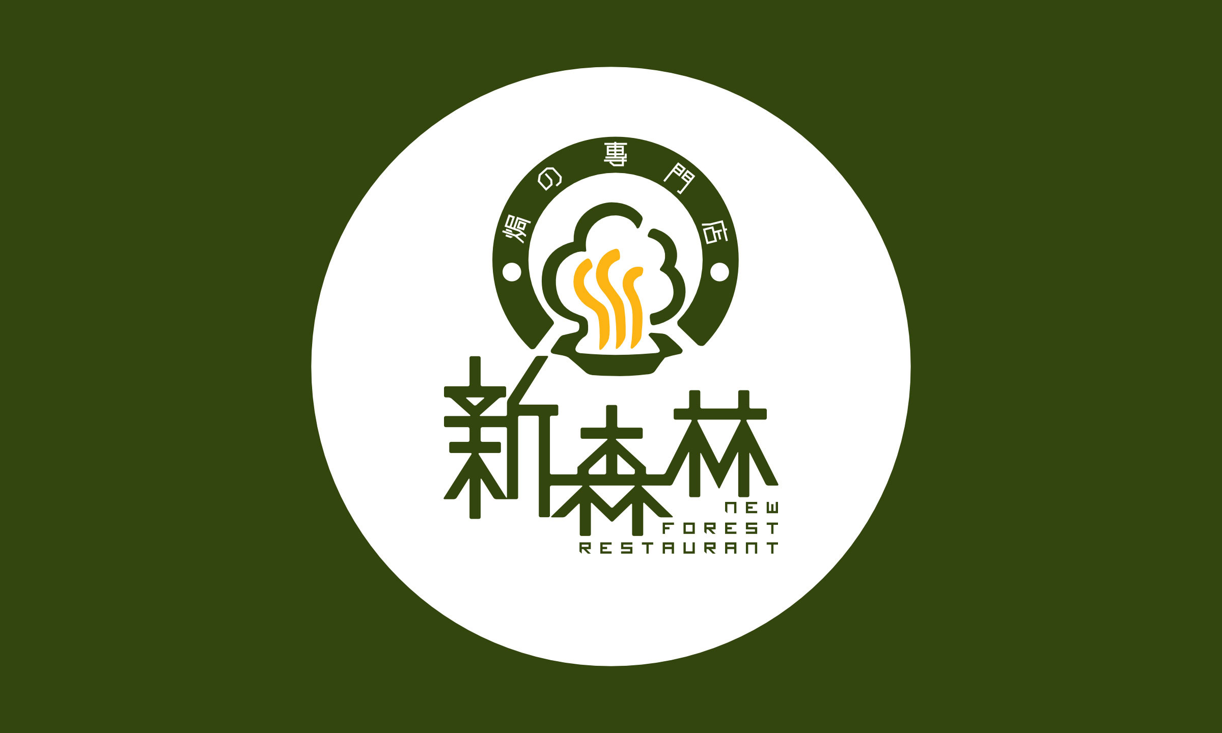
新森林レストランの旧ロゴには木の輪郭と「NFR」というイニシャルが含まれていましたが、プロフェッショナルではなく一般的に見えました。ロゴに含まれていた漢字は関連性がなく、フォントは時代遅れでした。そのため、レストランのブランドやシグネチャー料理とよく結びついていませんでした。
New Logo
ホーム
»
制作実績
»
ロゴのリデザイン
»
新森林ロゴのリデザイン
他のプロジェクト
Lange & Söhneの赤い封筒デザイン
Body Awakeningのロゴリデザイン
The Whiteroom ロゴ
Ciliconeのロゴデザイン
新森林ロゴのリデザイン
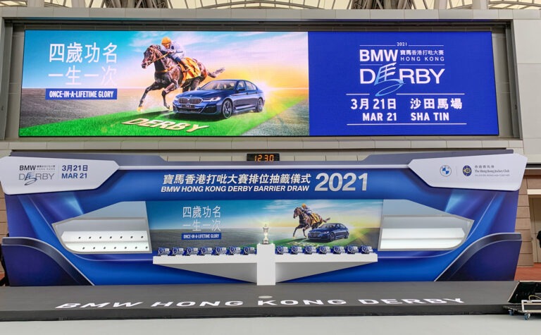
HKJC Event graphic design
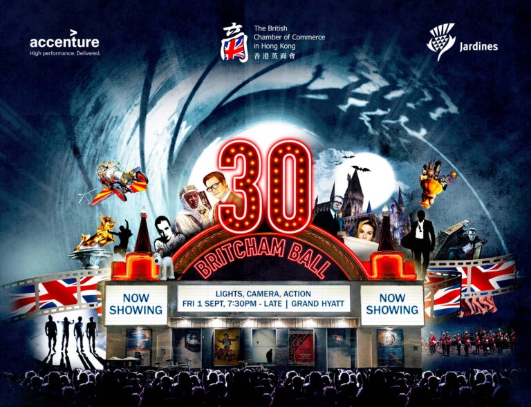
英国商業会議所の周年記念パーティー
Caffairロゴ
制作実績
ロゴデザイン
ロゴのリデザイン
パッケージ
印刷物
メインビジュアル
イベントグラフィック
キャラクターデザイン
テキスタイルデザイン
名刺デザイン
UI Design (coming soon)
ロゴデザイン
ロゴのリデザイン
パッケージ
印刷物
メインビジュアル
イベントグラフィック
キャラクターデザイン
テキスタイルデザイン
名刺デザイン
UI Design (coming soon)
ギャラリー
嶺南画派の絵画
嶺南画派の絵画
自己紹介
私について
出版物
私の本棚
私について
出版物
私の本棚
My journal
ブログ記事
アメブロ
ブログ記事
アメブロ
お問い合わせ
お仕事のご依頼やご相談がございましたら、ぜひお気軽にお問い合わせください。
Whatsapp
FB Messager
インスタ
Linkedin
メール