Caffair Logo
Founded in 2008 and based in Hong Kong, Caffair focuses on importing and servicing top-tier coffee machines. Their logo should embody their specialized knowledge.


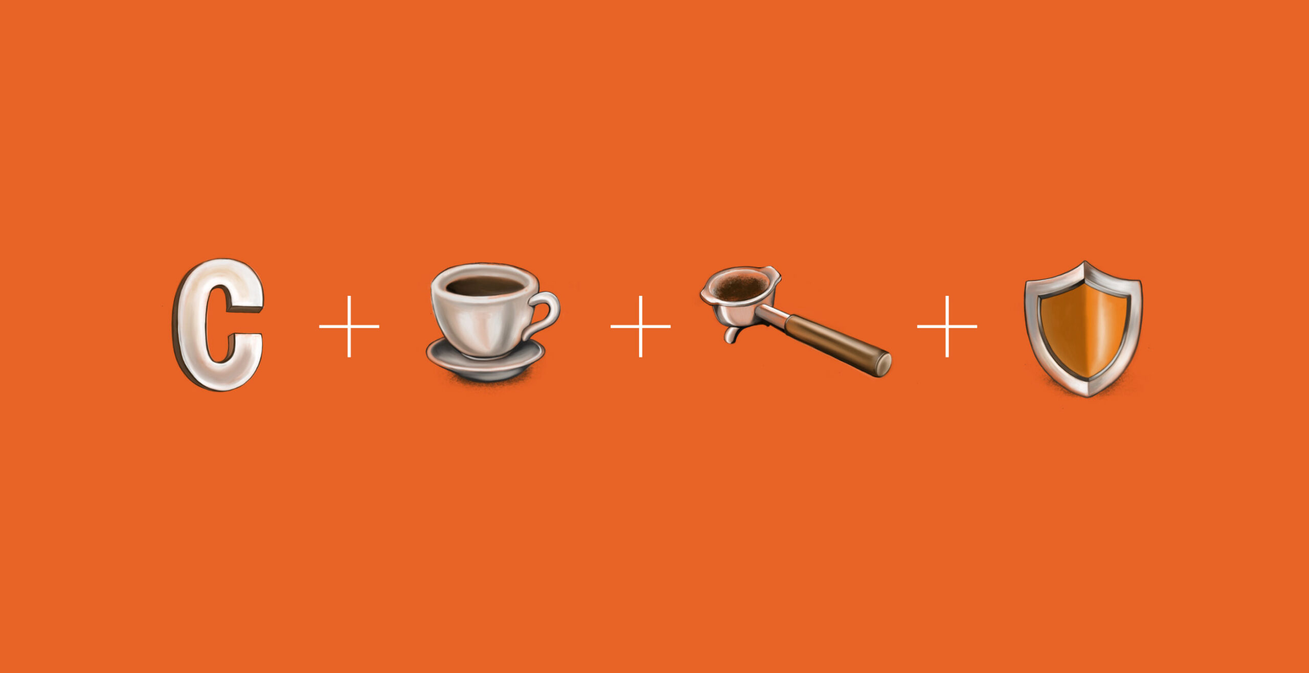
Caffair’s logo incorporates a C-shape and a shield, symbolizing the durability of their products. The negative space cleverly forms the image of a portafilter and a coffee cup. The color palette includes orange and yellow, which harmonize well with brown, reflecting the warmth and richness of coffee.