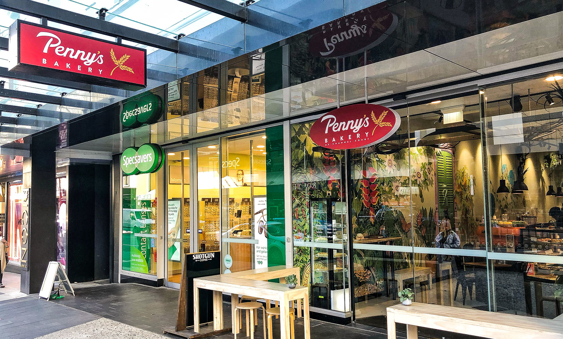
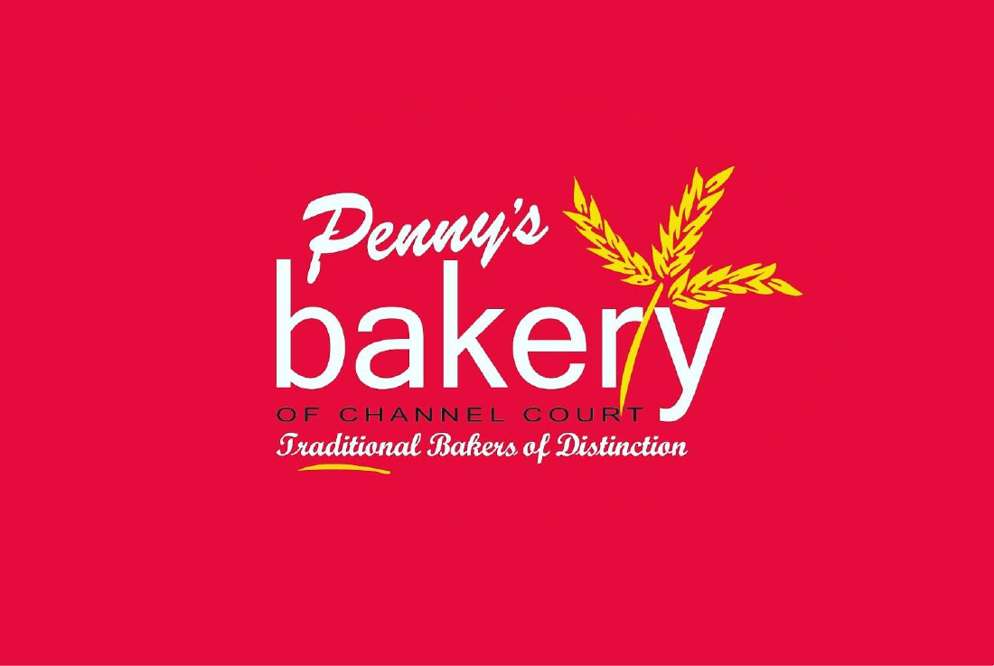
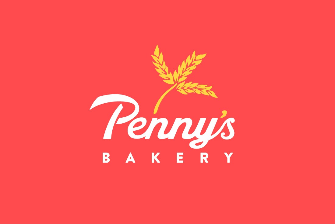
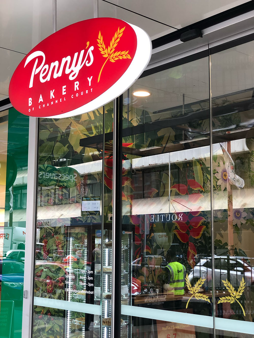
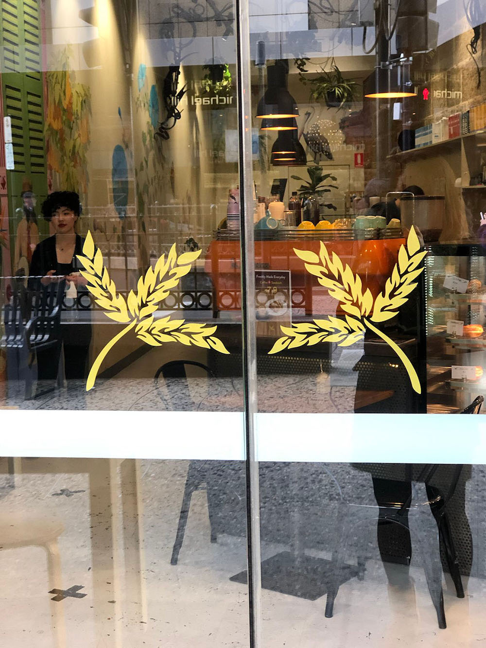
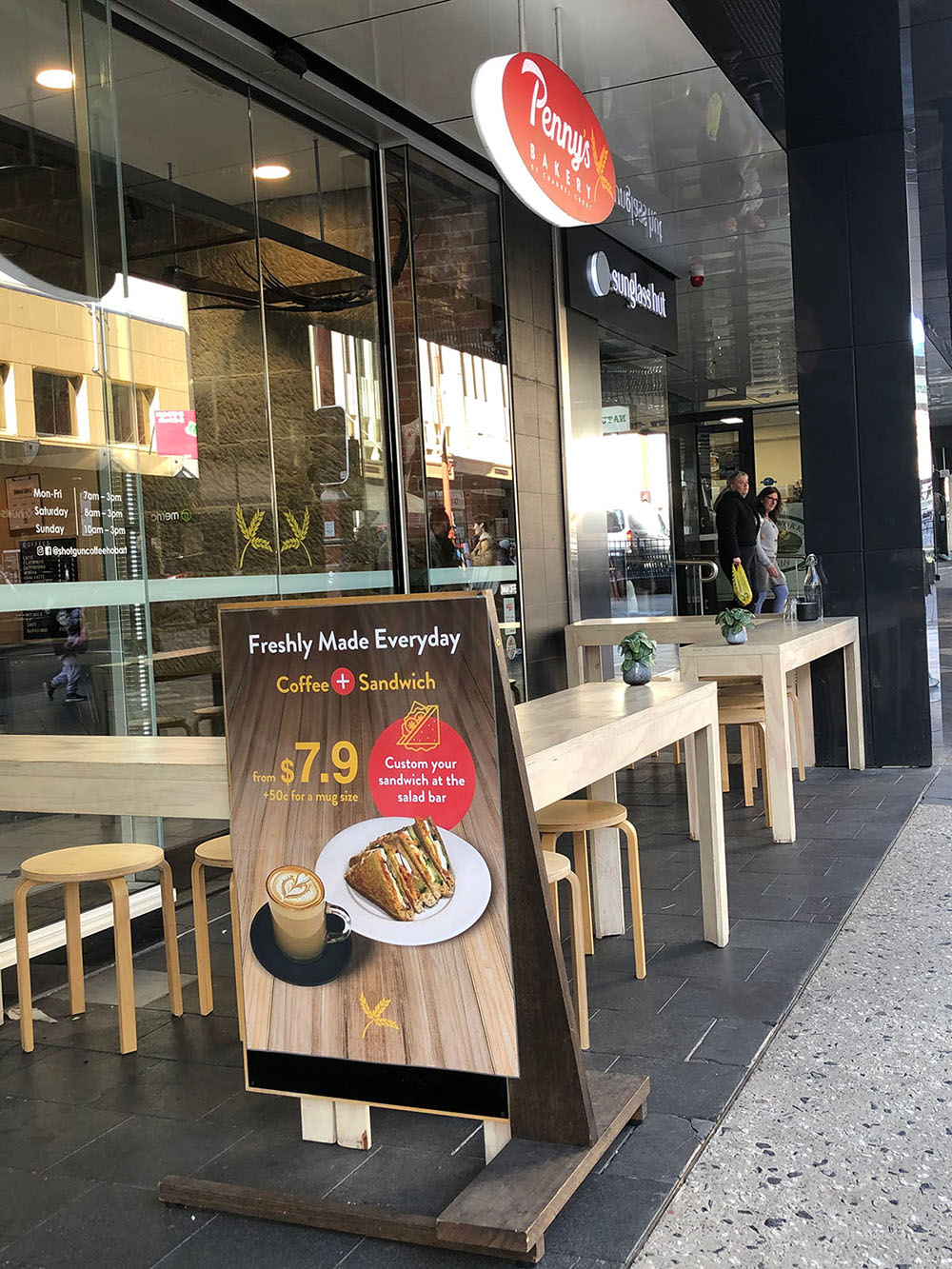
Penny’s Bakery, a cherished local bakery with locations in both Hobart city and Kingston, Tasmania, underwent a transformative rebranding. The refreshed image began with the wheat logo mark—a symbol of Penny’s commitment to fresh, high-quality baked goods. The logo now features a modern and friendly font, reflecting the warm and welcoming atmosphere of the bakery.
This rebranding extended beyond the logo, integrating the new look into all aspects of Penny’s Bakery, from shop signage and posters to coffee cups and stamp cards. The updated branding also graces the bakery’s social media presence, ensuring a cohesive and visually appealing experience for the community. With this refreshed identity, Penny’s Bakery is ready to continue being a beloved fixture in Tasmania.


