by alanika@gmail.com | Dec 31, 2025
Prime Priority Technology The new logo utilizes a clinical Teal palette to establish trust and hygiene, balanced with a Salmon Red accent that honors the brand’s heritage. The interlocking geometric ‘P’ symbol represents the seamless connection...
by alanika@gmail.com | Apr 25, 2024
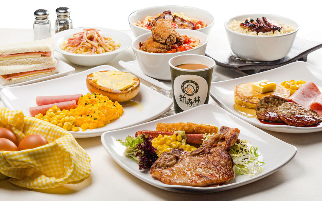
New Forest Restaurant I loved dining at New Forest Restaurant, famous for their baked dishes, while working at a graphic agency in 2003. Despite opening in 1998, the owner and partners found their logo unattractive and couldn’t pinpoint the issue or how to improve it....
by alanika@gmail.com | Apr 25, 2024
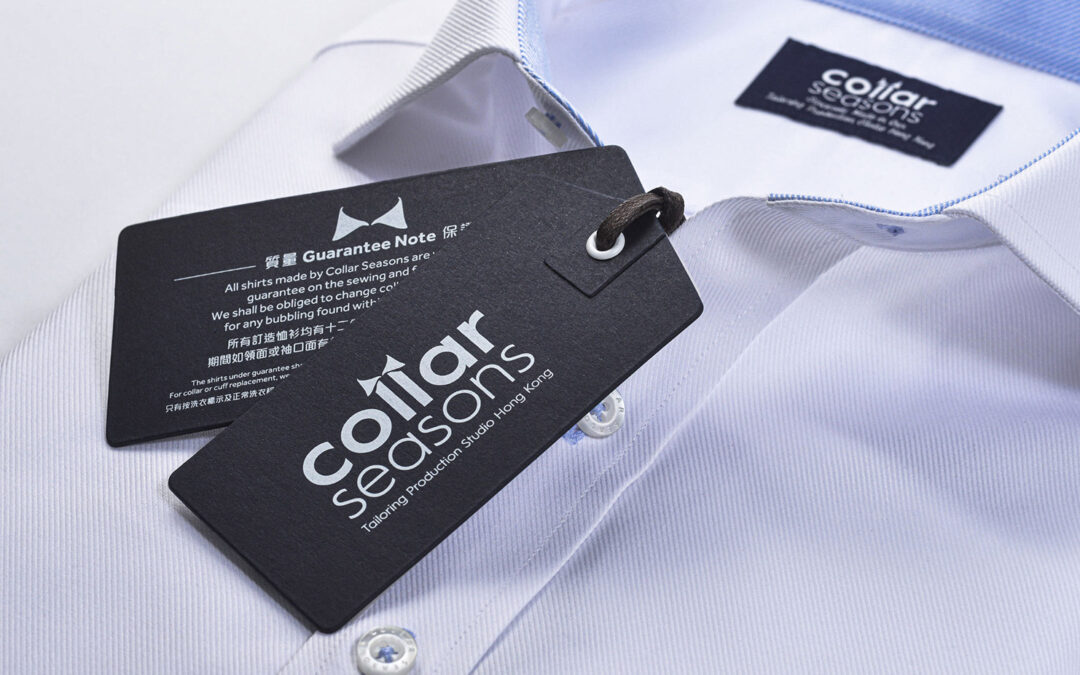
Collar Seasons Rebrand Collar Seasons, a Hong Kong tailor-made suits shop for over 20 years, caters to both older and younger businessmen. I redesigned their branding, including the logo, woven labels, and business cards. Factory Photos

by alanika@gmail.com | Apr 25, 2024
Body Awakening Rebrand “Ultimate freedom lies within a healthy, happy body and mind.” Body Awakening, a company specializing in health supplements such as Vitamin C, Probiotics, and Calcium, sought a fresh and modern rebranding to stand out in a...
by alanika@gmail.com | Apr 25, 2024
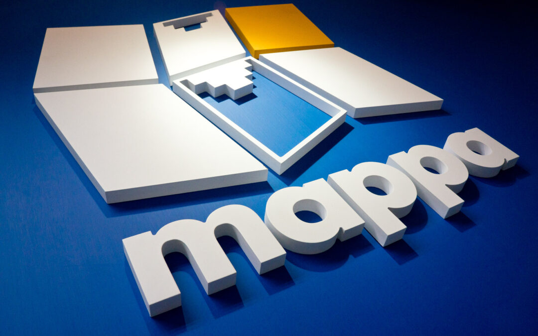
Mappa’s Logo Re-design I partnered with Mappa System Ltd. in 2005 for IT services, mainly GPRS mapping. They updated their old logo to a new one with an M and digital fold map, using tech blue and orange as the main and accent colors respectively. The main idea of the...